It's a brand that I hope people will be able to connect to and feel comfortable with
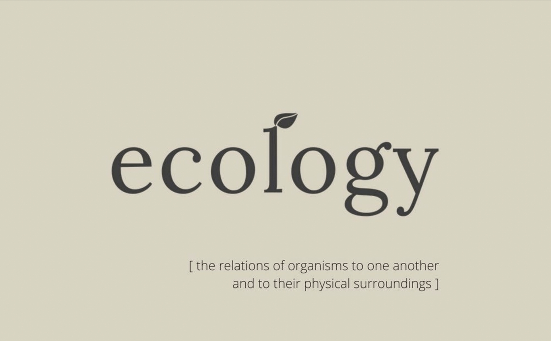
The 'ecology' name was something that came to me after many days of brainstorming. I liked the true meaning of the word and I feel that it reflected what we do; I liked the scientific and earth pairing too - it gives us the ability to use natural textures and design elements but in a very specific, considered way.
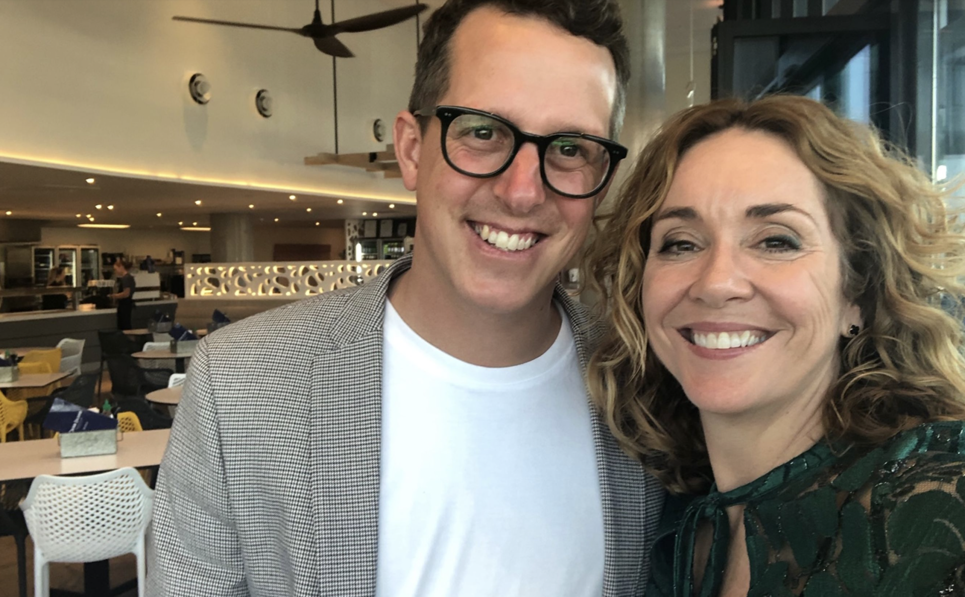
When I set out to create a real estate brand I wanted something that was a little less corporate feeling; I wanted a brand that felt good & wasn't afraid of taking a slightly different approach. It's a brand that comes from my inner self rather than a researched set of marketing ideals, it's a brand that I hope people will be able to connect to and feel comfortable with - polished but real.
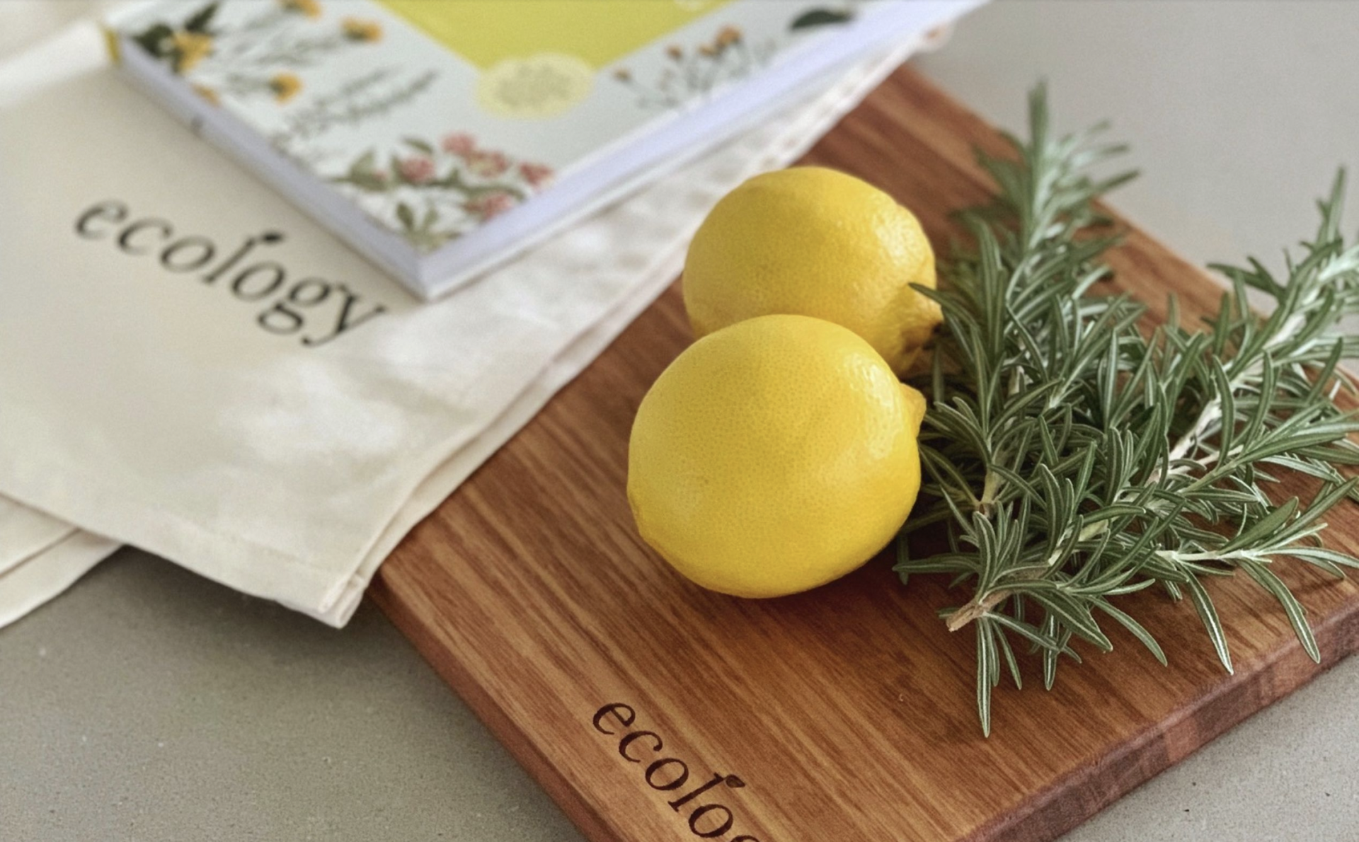
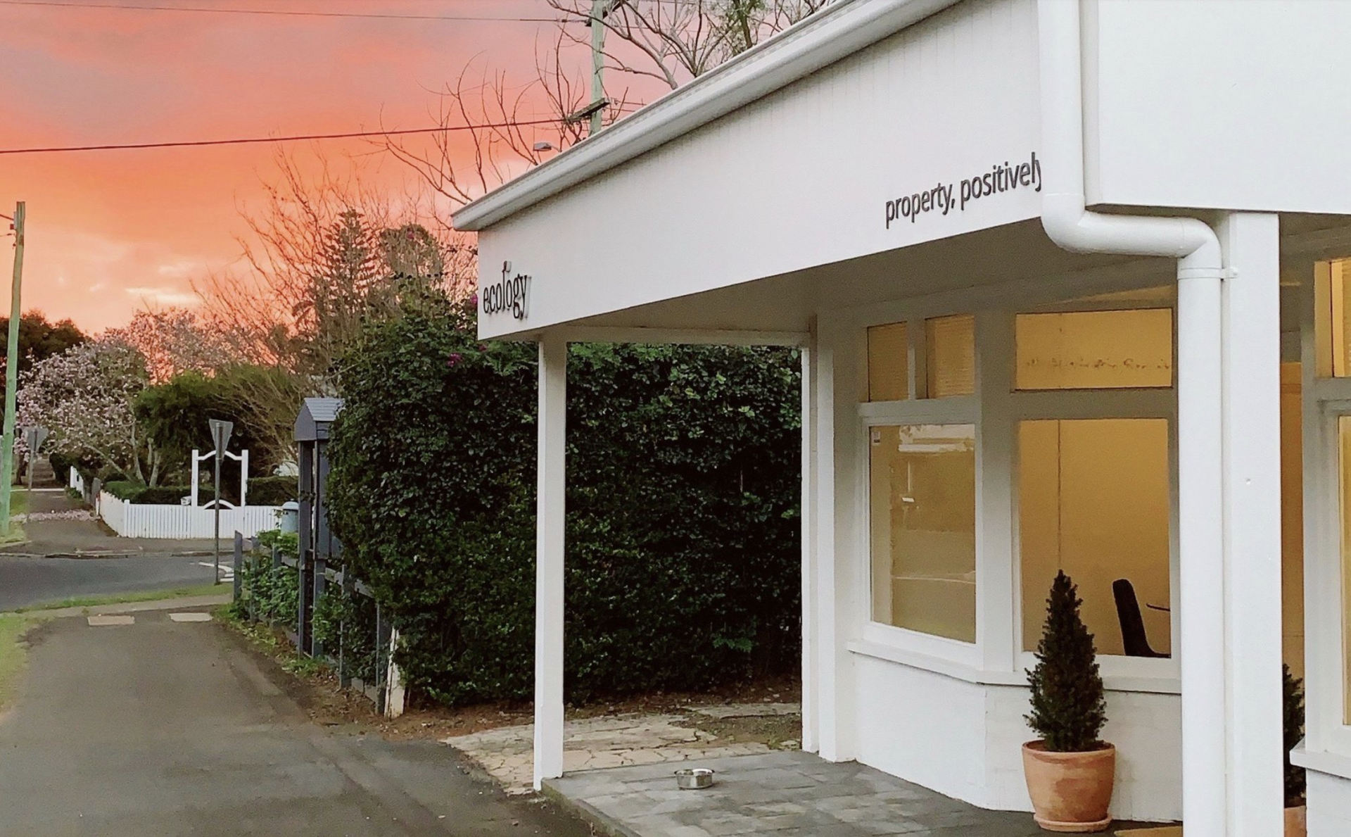
We wanted a logo and a set of colours that felt a little less 'real estate' and a little more 'real life'. Combine the joys of modern technology, time and a little bit of creative flair; voila! Our three brand colours include a pure white, a dark charcoal & our hero colour, putty. We elected to use a classical typography with the little leaf signifying growth and our earthy, minimal approach that'll flow through the other parts of the branding and collateral.
Other Journal Entries
